How to build a sales report your users can rearrange, with a React pivot table
Top countries and their best sellers, with units, average price and share of the year, built from 1,067,371 real invoice lines with a free React pivot table. What each field option does, two numbers that look right and are not, and what clicking a cell costs.
 KanuniLabs9 min read
A sales report starts as one table and turns into a queue of requests: the same numbers for another year, only the best sellers, the share instead of the amount, the invoices behind that one figure. Each request is a small change, and each one waits for a developer.
This post builds that report once, so that the person reading it can make those changes themselves. The data is real: the 1,067,371 invoice lines of the Online Retail II dataset, a UK online gift shop's sales from December 2009 to December 2011, with invoice number, product, quantity, unit price, customer and country on every line. The table is our free PivotGrid for React, and everything below is in its Community edition.
Here is the finished report: the eight countries with the most revenue in 2011, inside each one its five best-selling products, with units sold, the average price paid and each line's share of the year.
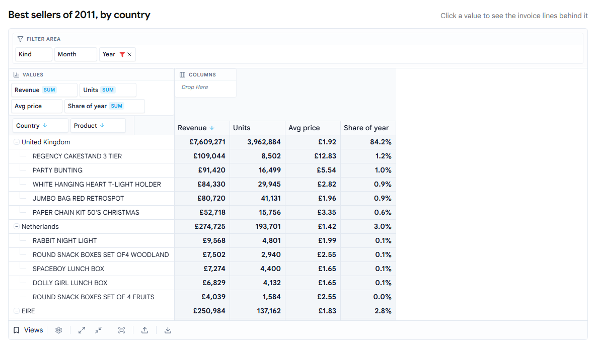
It is live at /demos/pivot-report. The sections below take it apart in the order it was built: the fields, the best sellers, two numbers the raw data gets wrong, the share column, saved views, and the invoice lines behind a cell.
The fields
A pivot table is configured as a list of fields. Each one names a column of your data, an area (rows, columns, values or the filter area) and how to show it:
import { BasePivotGrid, type PivotField } from '@kanunilabs/pivotgrid-react';
import '@kanunilabs/pivotgrid-react/styles.css';

const fields: PivotField<Line>[] = [
  { id: 'country', dataField: 'country', caption: 'Country', dataType: 'string',
    area: 'row', areaIndex: 0, sortOrder: 'desc', sortBySummaryField: 'revenue', topN: 8 },
  { id: 'product', dataField: 'description', caption: 'Product', dataType: 'string',
    area: 'row', areaIndex: 1, sortOrder: 'desc', sortBySummaryField: 'revenue', topN: 5 },
  { id: 'revenue', dataField: 'revenue', caption: 'Revenue', dataType: 'number',
    area: 'data', areaIndex: 0, summaryType: 'sum' },
  { id: 'units', dataField: 'quantity', caption: 'Units', dataType: 'number',
    area: 'data', areaIndex: 1, summaryType: 'sum' },
  { id: 'year', dataField: 'year', caption: 'Year', dataType: 'string',
    area: 'filter', filterValues: new Set(['2011']), filterType: 'include' },
];

<BasePivotGrid gridId="sales-report" data={lines} initialFields={fields}
  layout={{ rowHeaderLayout: 'tree' }} />;
Everything set here is also on screen. The year filter is a chip in the filter area with a filter icon on it; the sort is an arrow on the Country and Product chips. A user who wants 2010 opens the Year filter and ticks it, without anyone editing the field list.
Best sellers per country
sortBySummaryField: 'revenue' orders countries by their revenue instead of alphabetically, and topN: 8 keeps the first eight. The same two options on Product apply inside each country, so every country gets its own top five, not the shop's overall top five.
The cut changes what is listed, not what is counted. The grand total at the bottom is still the whole year, every country included: £9,032,994. The United Kingdom alone is 84.2% of it.
Postage is the UK's best seller
The first version of this report put DOTCOM POSTAGE at the top of the United Kingdom, ahead of every product. Germany had POSTAGE and Manual in its top five, Ireland Manual and CARRIAGE.
The dataset mixes products with everything else that goes through an invoice: postage, carriage, marketplace fees, bad-debt write-offs, bank charges, manual adjustments. Ten descriptions in all. A best-seller report should not count them at all, so they are removed with a prefilter, a condition applied to the source rows before anything is grouped or summed:
const NOT_PRODUCTS = ['DOTCOM POSTAGE', 'POSTAGE', 'CARRIAGE', 'AMAZON FEE', 'Adjust bad debt',
                      'Manual', 'Bank Charges', 'Discount', 'CRUK Commission', 'SAMPLES'];

<BasePivotGrid /* … */ layout={{
  rowHeaderLayout: 'tree',
  prefilter: { logicalOperator: 'and',
               conditions: [{ fieldId: 'product', operator: 'notin', value: NOT_PRODUCTS }] },
}} />
Because it runs before aggregation, it changes the totals too: the year's grand total is product revenue, not product revenue plus postage minus fees.
A cancelled order in the top five
With postage gone, the next surprise was PAPER CRAFT, LITTLE BIRDIE: £168,470 and 80,995 units, the UK's best seller of 2011. One customer ordered 80,995 paper birds at 06:15 on 9 December 2011 and cancelled the order twelve minutes later.
Whether it shows up depends on one filter, the one on the Kind chip. The demo gives every line a Kind, read from its invoice number: a sale, a cancellation (numbers starting with C) or an adjustment (starting with A). Filter Kind to Sale and you are adding up orders, including the ones that were taken back; the paper birds win. Leave Kind unfiltered and cancellations subtract from the products they cancel; the paper birds net to £0 and drop out, and Regency Cakestand leads with £109,044.
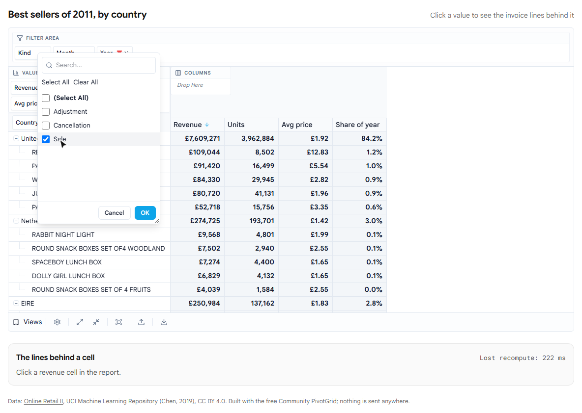
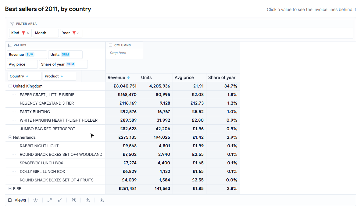
The report uses net revenue. The Kind chip stays in the filter area, so anyone who needs gross sales can switch.
Average price is computed after the sum
The average price column is the one that is easiest to get wrong. Put the unit price in the values with summaryType: 'avg' and you get the average of the line prices: for Regency Cakestand in the UK, £14.07. But a line for one cake stand and a line for 192 count the same in that average. What customers actually paid per unit is revenue divided by units, £12.83, because the large orders were the cheaper ones.
That ratio has to be computed per cell, after revenue and units are summed. A summary-level calculated field does exactly that:
import { compileSafeFormula } from '@kanunilabs/pivotgrid-core';

const AVG = '[Revenue] / [Units]';
const avgPrice: PivotField<Line> = {
  id: 'avgPrice', caption: 'Avg price', dataType: 'number', area: 'data', areaIndex: 2,
  isCalculated: true, formulaType: 'summary', formulaString: AVG,
  calculateSummaryExpression: compileSafeFormula(AVG, new Map([['Revenue', 'revenue'], ['Units', 'units']]))!,
};
The formula language is deliberately small, field references, numbers and arithmetic, and it is compiled without eval, so a formula can come from a saved report without running code. Computed row by row instead, the same formula would divide each line and then add the quotients, which is a number with no meaning.
Share of the year
The last column is revenue again, shown as a percentage of the column total:
{ id: 'share', dataField: 'revenue', caption: 'Share of year', dataType: 'number',
  area: 'data', areaIndex: 3, summaryType: 'sum', summaryDisplayMode: 'percentOfColumnTotal' }
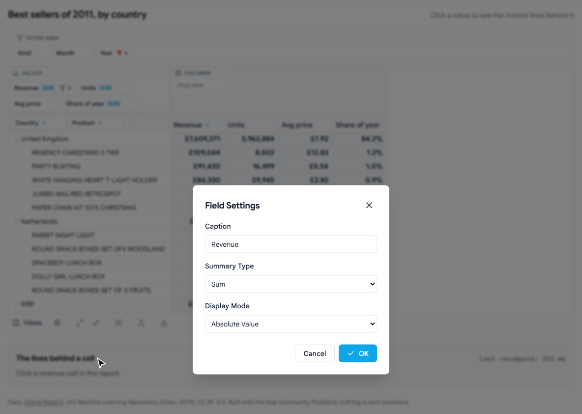
Users can make the same change without code: right-click a value chip, open Field Settings, and pick % of total, of row or of column, a running total, or the difference or % difference from the previous value.
Let users keep their version
Once users can rearrange a report, they will want to keep what they built. The Views menu in the footer saves the current fields and layout under a name, loads it back, updates it, and can set it as the default that opens next time. The grid also remembers its last state per gridId across reloads.
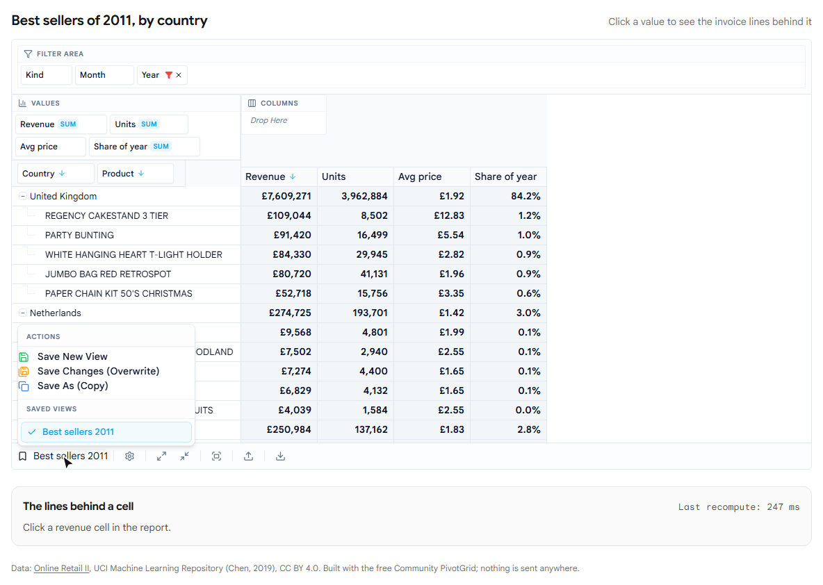
By default this lives in the browser's localStorage, so a view saved on one laptop is not on the next one. To keep views per user on your server, pass stateStoring={{ enabled: true, type: 'custom', onSave, onLoad }} and store the state object yourself.
Click a number, see the lines
The question after "what are the numbers" is "where does this one come from". Pass onCellClick and the grid hands you the source rows behind the clicked cell:
<BasePivotGrid
  /* … */
  onCellClick={(e) => {
    if (e.cellType === 'rowHeader' || e.cellType === 'colHeader') return;
    showLines(e.records ?? []);
  }}
/>
What you render is up to you. The demo lists the 50 largest lines and adds them up next to the cell's value. For Regency Cakestand in the UK that is 1,686 invoice lines summing to £109,044, the same figure the cell shows.
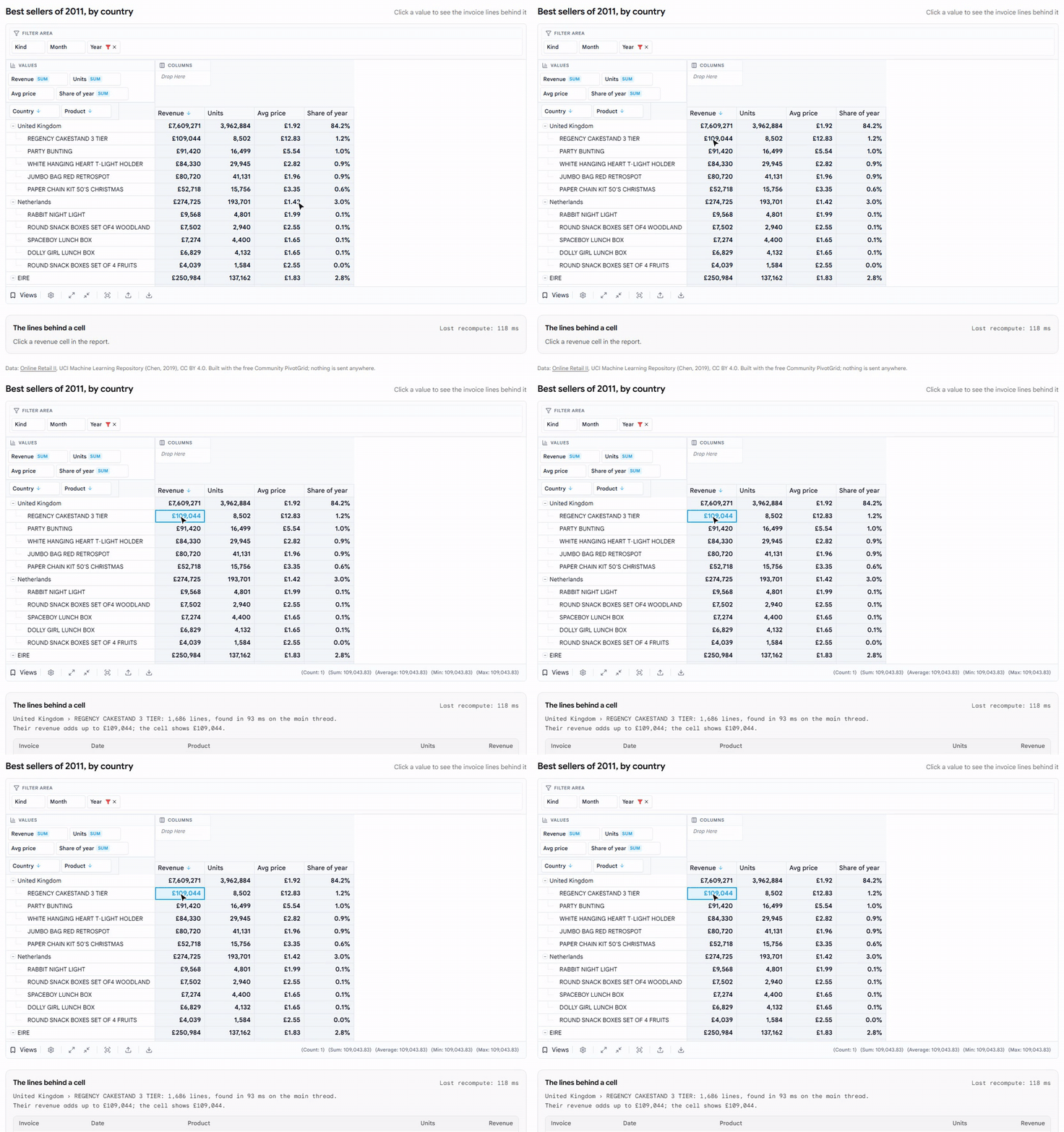
That lookup has a cost worth knowing. The grid does not keep the rows behind each cell; when the handler reads e.records, it finds them again, on the main thread, matching the cell's row and column path first and applying the filters only to those rows. Finding these 1,686 lines among a million took 43–93 ms in our browser. The cost follows the number of rows behind the cell: the United Kingdom's total, 453,888 lines, took 363–529 ms (that includes the demo sorting them). Fine for a click, but it is time the page cannot respond. A handler that never reads records pays nothing.
How fast is the rest
Every change to this report regroups all 1,067,371 rows. The aggregation runs in a Web Worker, off the thread that handles clicks and typing; on the live demo a recompute of this layout took 83–222 ms over five runs, most of them under 120. Our previous post measures that in detail, including the longest pause it causes on the page.
Limits
- The data has to be in the browser. The demo downloads a 5.5 MB file once and decodes it into a million row objects. For data that should stay on the server, the paid edition can ask your server for the aggregates instead.
- Reading a cell's records runs on the main thread: tens of milliseconds for a product, around half a second for a whole country, as measured above.
- No "Others" row in this report. The top-N options can fold the cut countries and products into an "Other countries" row (
topNShowOthers); this report leaves it off. Writing this post we found two bugs in it (under a second top-N level the outer Others row stayed empty, and a calculated ratio was added up instead of recomputed); both are fixed in PivotGrid 1.9.0. - Paid parts. The formula designer that lets end users write calculated fields, a ready-made drill-down window, rendered charts and styled Excel/PDF export are in the paid edition. Everything in this report is free.
Try it
The report is at /demos/pivot-report: drag Month into the columns, untick a country in its filter, click any value. The PivotGrid docs cover fields, top-N, calculated fields, display modes and saved views for React and plain JavaScript.
Data: Online Retail II, UCI Machine Learning Repository (Chen, 2019), CC BY 4.0.
Disclosure: this article was drafted with AI assistance. The demo and every number in it were measured against our packages and the published dataset in October 2026.